
Oliver Boonjing on shooting digital bolex for Notre Salut
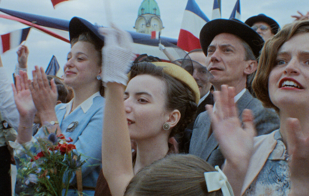
Following its notable selection for the Official Competition at the last Cannes Film Festival—
where Emmanuel Marre’s « Notre Salut » won the Screenplay Award—and ahead of its theatrical
release in September 2026, the film’s cinematographer, Olivier Boonjing (SBC), reflects on his
collaboration with Marre and discusses the shoot.
Tell us about the project’s origins.
I’ve known Emmanuel Marre since we first worked together on his short film « Le Film de l’été ».
We subsequently shot his debut feature, « Rien à foutre » (co-directed with Julie Lecoustre), which
was released in 2021. We developed a shared visual rapport from that experience, which helped us
approach « Notre Salut » with a sense of calm and confidence.
To kick off the process, Manu wanted to hold a five-day workshop with all the department heads for
an in-depth technical read-through. He knew from the start that the goal wasn’t to stage the written
scenes literally, but rather to find the right shooting setup.
Aesthetically, Manu’s initial preference was Super 16mm. However, there were several limitations:
cost—based on 90 minutes of rushes over a 45-day shoot, the outlay for purchase, processing, and
4K scanning alone would have hit €140,000, with logistics potentially adding another €40,000. The
length of the takes would also have made film stock management cumbersome and wasteful;
combined with the desire to pay fair wages, Super 16 proved too restrictive.
Manu wanted a very lightweight camera. While the Bolex seemed like a possibility for our initial
film-based approach, it only has a three-minute runtime and lacks a video tap, meaning Manu
wouldn’t have been able to see the image. I was sitting next to Sébastien Andrès, the producer from
Michigan Films, and we soon started discussing other options. I knew Manu would never accept a
RED or an Alexa, so I told Seb, “The only obvious option I can think of is the Digital Bolex.” I
knew Olivier Tordeur had one with an uncalibrated sensor.
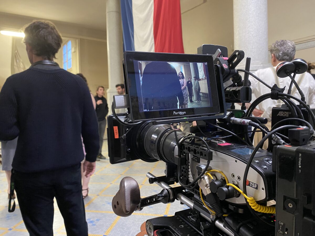
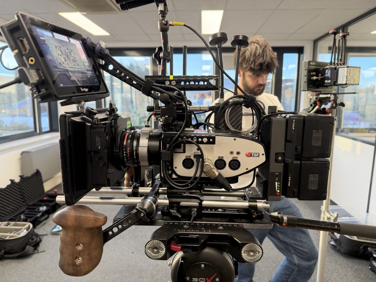
The real advantage was the miniature camera—specifically, the C-mount version of the Digital
Bolex.
The Digital Bolex has two CCD sensors that require calibration; if the temperature of the two
sensors isn’t right, a vertical line appears.
We wanted to run comparative tests between 16mm film and the Digital Bolex using the same
lenses. It became quite apparent that the film stock had a 70s or 80s look but didn’t really evoke the
1940s. In any case, color and contrast grading would be necessary, so the workload was similar
either way.
The idea of using 500T stock throughout could have worked—it’s an emulsion that desaturates—
and the Scanity scan provided by the lab gave us a beautiful visual reference.
During the test shoots—using a light attached directly to the camera—we realized the Digital Bolex
actually looked better than the film. However, we also found that the Bolex was potentially a bit
less light-sensitive than the film stock.
We decided to buy the Digital Bolex cameras since they aren’t available for rent; we needed to
purchase three of them to ensure we were fully equipped and wouldn’t be stuck if one broke down.
We wanted to guarantee they were in good condition and planned to have them serviced and
upgrade the recording cards to 2TB SSDs. Ultimately, between shipping, insurance, and customs
duties, it wasn’t a cheap undertaking. The camera is rated at 800 ASA, but it actually performs
closer to 640. So, I created a LUT based on 640 to protect the shadows a bit; this was displayed on
the external monitor I used for framing. While the LUT wasn’t always reliable regarding white
balance, the exposure display was accurate. The Bolex outputs Bolex Log in 2K DNG; when the
camera launched in 2013, it was difficult to handle in post-production, but thanks to advances in
computing power, the process is much simpler now. We also realized that the Digital Bolex renders
color incredibly well—better than the Alexa Mini, and almost like film stock, actually. The greens,
in particular, are stunning. So, after seeing all this in our tests, we decided this was the right path to
take, especially since we knew we could get a PL-mount version of the Cooke 10–30mm zoom—
our primary lens—as well as a second, longer-range zoom, the Canon 11.5–138mm. The 10–30mm
zoom is sublime, it was used extensively by Ed Lachman on Todd Haynes’ film « Carol ». It
vignettes slightly in Super 16, but the Digital Bolex sensor is a bit smaller, so there was no
vignetting. It opens up to T1.6 and has excellent close-focus capabilities.
The results are truly beautiful.
We shot a small portion in Brussels using very dark sets, where I used Zeiss Super Speed lenses. In
Limoges, we made extensive use of a B-camera—a digital Bolex with a C-mount—for which I went
looking for lenses. I tried out Bolex lenses but found them rather mediocre.
Canon made some 16mm lenses—a 13mm T1.5 and a 25mm T1.4—that we thought were fantastic;
they have a look similar to Canon K35s.
One of the Bolex cameras we bought came with an 8mm T1.4 Kowa surveillance lens. It turned out
to be a very high-quality lens with exceptional sharpness. I bought the whole set, so we had Kowa
T1.4 lenses ranging from 6mm to 50mm, which we used a lot. We added a 1/8 Black Glimmerglass
filter, plus a low-contrast filter that we also used on the A-camera. These lenses were used on the
compact C-mount digital Bolex, where the camera operator had to pull focus manually.
Tell us about your artistic and technical relationship with Emmanuel Marre.
Manu wanted to shoot with zoom lenses and be able to zoom during the takes.
We ran a few tests, and it became quite clear that it was better for Manu to control the zoom
tightening or widening the frame as the moment required. I actually enjoyed this; it added an
element of surprise and also showed me what Manu wanted to highlight.
That said, there were times when Manu would leave me zoomed all the way in on a long focal
length right before walking up a flight of stairs, and I’d be praying he’d zoom back out! I really
have to thank Sebastien Andres from Michigan Films for quickly finding a way to get the Digital
Bolex to me; it gave me the time I needed to source all the accessories to make the camera
ergonomic.
In the end, we used three cameras, two of which were repaired and brought back to life specifically
for the film. The sensors are high quality, and the footage really captures that CCD magic I love so
much. The vertical flare visible at a few points in the film, for instance, it’s such an unusual look;
it’s like a signature.
I had extensive discussions with Joe Rubenstein, who created the Digital Bolex alongside Ed
Schneider. The cameras were hand-assembled in Canada back then, and they realized the sensor
needed to run hot at 55°C for the best image quality. Since the sensor actually consists of two
separate sensors with a vertical split down the middle, the camera had to be turned on well in
advance each morning to warm up; otherwise, the seam between the two sensors would show up in
the image.
Manu Marre really loved that truly artisanal quality.
We did a lot of research into the gear used by journalists of that era, typically a few prime lenses
and a zoom, and tried to emulate that setup.
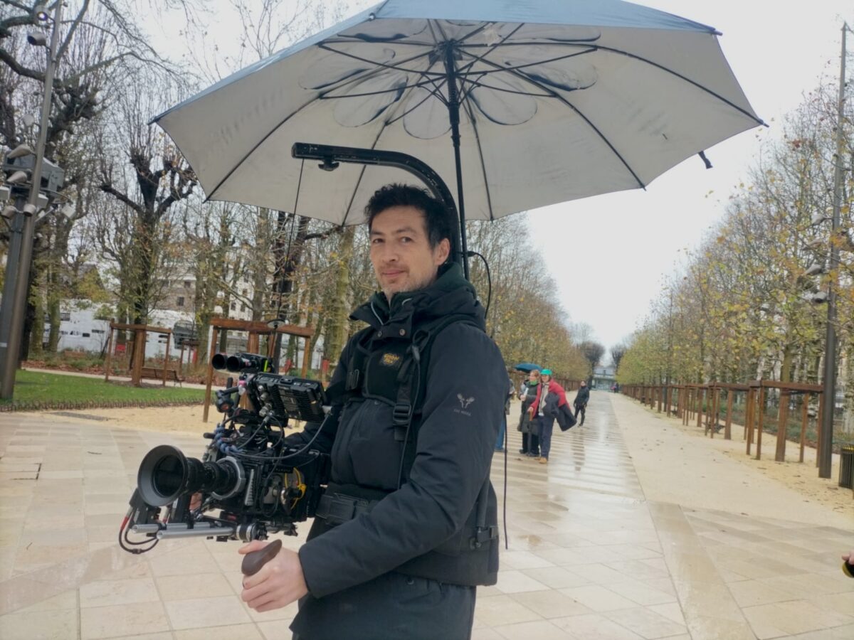
We used two camera configurations, which really influenced the framing energy: one fully rigged
camera for tripod or standard shoulder-mount work, and a handheld setup that allowed for low-
angle framing, reminiscent of medium-format cameras from that period.
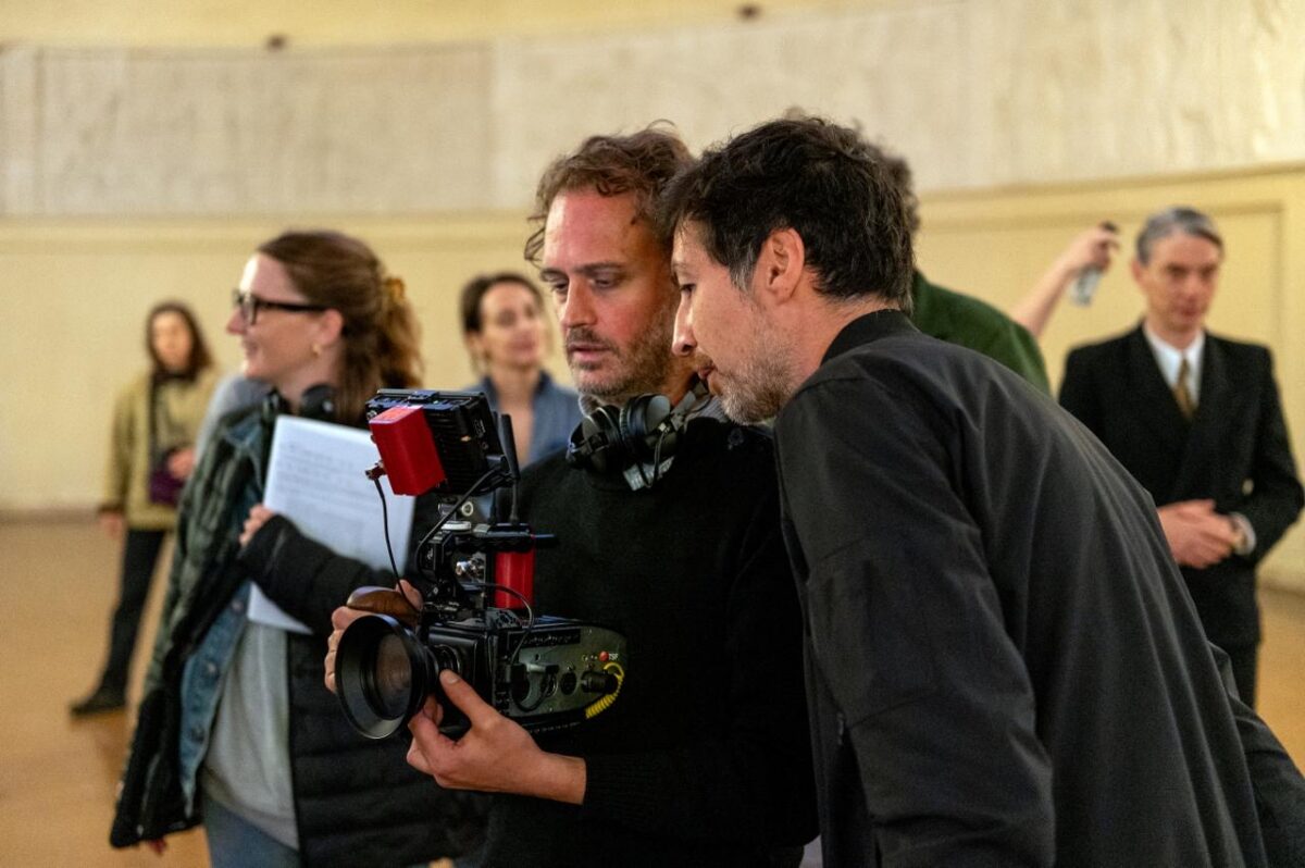
Manu is passionate about photography and always deeply engaged with the camera; he needs to
make the technical and artistic tools his own. He often took the camera to frame shots himself. I
always considered him part of the cinematography team. For every film we’ve made together, the
technical and aesthetic choices regarding the visuals have always been made jointly.
It’s a real pleasure working with a director who understands the technical side of things while also
pushing you to explore further.
And regarding the lighting, what choices did you make, what was your overall approach to the
film, and how did you tackle a period piece?
The lighting relied mainly on practicals. Manu and I used to joke that it was the era of mosquitoes:
people would gather around light sources at night, so we had to leave areas in shadow.
I ran a lot of tests with tungsten filament bulbs to preserve that characteristic filament warmth, but
given the Bolex’s limited sensitivity, I quickly had to consider high-wattage bulbs which wasn’t
realistic for the wall sconces we were using. So, I turned to LED bulbs and realized that dimmable
OSRAMs offered excellent rendering. I ended up using a small stock of OSRAM bulbs.
There were only two of us in the camera department Tom Vander Borght and myself with no chief
electrician or key grip, so the lighting had to be very simple. Anna Falguères (the production
designer) and I often joked that she was my chief electrician.
There were plenty of people on the crew, though, especially in the hair, makeup, and costume
departments. Manu managed to create a documentary-style atmosphere on set while maintaining the
logistical infrastructure, hair, makeup, costumes, and so on, of a period film.
That documentary feel persisted even during exterior shoots.
We did a lot of location scouting to find buildings that looked authentic to the era and to identify
credible camera angles. We even spent a day walking around Vichy with the camera without
permits. In fact, a few of those shots made it into the final film such as the shot of him smoking at
sunset near the beginning.
Low-angle shots helped us a lot, too, since there are more anachronistic elements at ground level…
Production designer Anna Falguères did an incredible job. Making a period film on that budget is a
real challenge, even for the interiors, and especially given the large number of sets involved. Manu
wanted a 360-degrees set… A huge portion of the budget was earmarked for set design, costumes,
and hair, that was where the money really mattered. The aim was to put as much of the budget as
possible in front of the camera, on set design, costumes, hair, and extras, rather than spending it on
lighting, grip equipment, and cameras.
Walk us through the typical setup for a sequence, how does it work?
I start by setting up the lighting, putting bulbs in the wall sconces so everyone can actually see. I
turn on the Bolex camera to let it warm up, then wait while discussing the sequence with Manu and
the actors. For me, this is the most important part: we figure out where to place the camera, and I
have time to walk around, check the lighting levels, and scout the potential areas where the action
will take place. Then, at a certain point, it all clicks. The actors find the rhythm of the scene, and we
start shooting. We shoot intensely and quickly. We might do two or three fairly long takes, and then
we’re done. The takes last much longer than the final edited version; they have an almost
documentary-style duration, from which he selects specific moments during the edit. And much to
the camera operator’s dismay he sometimes keeps the reframing adjustments in the final cut. It’s
part of the style. But he’s right, absolutely right; it creates energy, and he doesn’t try to hide the
camera’s presence.
Unlike other departments, the cinematography approach is like a documentary, but with the
flexibility to adjust light sources and retake the shot if necessary. For me, it involved a lot of prep
work to select the right gear to achieve the feel Manu was after. But on set, during the actual
filming, it was very straightforward, even though doubts and technical issues can always crop up!
There’s a sequence near the end of the film where the character crosses a square and walks past a
Nazi flag. It looks like a simple shot, but the entire center of the square is actually unlit. On a
standard shoot, you’d adapt by using the available equipment and crew to light it up. But in that
instance, I didn’t have the right gear… I’ve rarely sweated so much. We attached three low-wattage
LED units to the square’s central pole to cast light down onto the ground, switched on car
headlights, and so on. It calls for a bit of inventiveness and on-the-fly adaptation!
The takes are long, and everything is shot as a continuous master shot, with each take differing
slightly from the last. When Manu sets up a sequence, he knows exactly what story it needs to tell.
The script is always beautifully written, but it serves merely as a preparatory document. Ultimately,
the characters’ objectives and the goals of the scenes are very precise, potentially more so than in
other films, yet the actual form the scene takes can be completely reinvented based on the moment
and the staging with the actors. He is very open to things unfolding differently.
In the end, our lighting package included just a few low-power LEDs; it was extremely minimalist.
It simply requires everyone to adopt a documentary mindset.
You mentioned torches earlier, those “photographic flash”-style lights that lend a documentary
feel and were also a lighting method you used on « Rien à foutre ». Could you tell us more about
that?
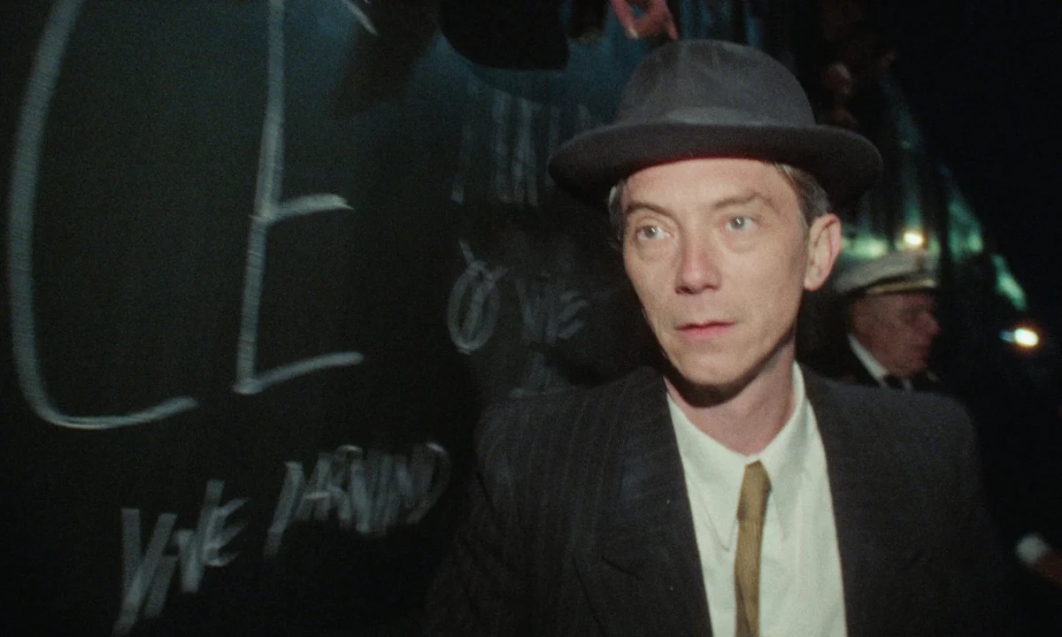
Manu wanted to shoot using a torch, partly as a nod to those old Portuguese documentaries from the
60s. I found a 30W SmallRig torch that could be focused into a tighter beam to match the zoom’s
focal lengths.
The moments lit by the torch were planned out; there’s a sort of rhythm to this lighting style written
into the script. Take the shot where Swann is riding his bike at night, that was designed to be lit by
the torch. It was actually pretty tough for him; he couldn’t see where he was going and just had to
follow the light!
We’d used this effect on « Rien à foutre », but that involved a very light-sensitive camera an S1H so
my approach was to keep the ambient light, crank up the ISO, and use the torch at a low setting.
With the digital Bolex, which is much less sensitive, I had to use the torch at a higher intensity.
For Manu, this flash-like light was also crucial for going against the grain of “academic” period-
piece lighting. You know, strong backlighting, shafts of light, high contrast; all the hallmarks of a
classic period film. Manu has such a deep understanding of imagery that he thinks all this through
beforehand. I feel very lucky to collaborate so precisely on the visuals with a director who knows
exactly what he wants. We’ve also developed a natural shorthand, having worked together on three
films now.
That doesn’t stop me from having moments of doubt, where I push him to look at the rushes just to
make sure I’m really delivering what he’s after! A major asset for a film made this way is the editor,
Nicolas Rumpl. There isn’t an editor in the world more gifted than Nico when it comes to found
footage! Manu doesn’t let him read the script, and he receives all the raw footage out of order and
we’re talking about 80 or 90 hours of it. That also enhances the documentary feel of the film.
Let’s talk a bit about the image texture. There are some very beautiful colors, with a look very
similar to period photographs. I’m thinking, for example, of the main character’s visit to the
workers’ barracks. How did you achieve this look?
Manu Marre showed me a lot of photographic references. I didn’t know this, but there were some
photographers who had access to the first German color film at the time. So there is period
documentation in color, such as André Zucca’s photos of Paris under the occupation, and some local
photographers. The rendering was particular, difficult to describe, but I have the impression that
there was a lack of color in the yellows, a slightly pastel quality. The contrast was both low and
very wide, with somewhat soft lenses. Manu spontaneously wanted fairly colorful images, and I
told him that we needed to give the impression of letting the era unfold before us, so some moments
would be colorful because the environment is colorful, while others would be more neutral. The
environment should express itself, not us.
With Loup Brenta, the colorist, we used a Super 16 base at 500T in Filmbox, heavily desaturating
certain colors. The digital Bolex’s basic rendering is very digital. There’s absolutely nothing film-
like in the mathematical interpretation of the DNGs, of the Digital Bolex in Resolve. But you also
immediately see that it’s not what an Alexa gives you and that it reacts almost better to color
grading. In our vintage direction, it responded quite nicely, even in terms of signal dynamics.
So I shot the camera at 640 ISO. There are a lot of dark costumes in the film, and I wanted to
maintain dynamic range in the shadows. We opted to overexpose the windows and the stage lights,
which is why we experimented with quite a few different halations for the highlights. There’s a
setting in the new filmbox called Aura that simulates film stock by adding a small red halo, which
worked very well on the stage lights.
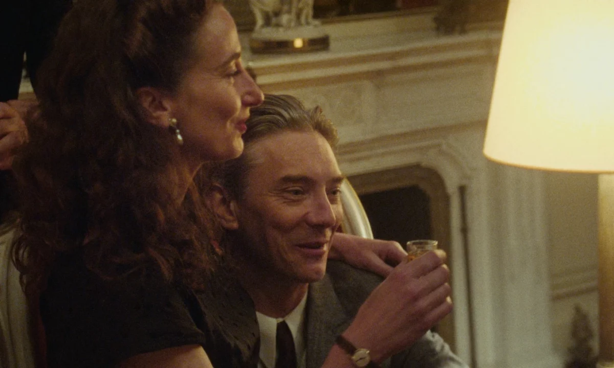
Ultimately, the film is still colored when it needs to be. These are colors that don’t align with most
viewers’ expectations of a period film. One of the film’s strengths, visually, is that the “period”
aspect is present through many elements such as the sets, costumes, and hairstyles, while at the
same time, the lighting has a rather modern feel, with slightly greenish hues and highlights that are
very white, not overly yellow. In a period film, the reflex might be to tint the highlights yellow and
use many lights with naturally yellow filament bulbs. It was a real question because we filmed in
quite a few historic buildings, lit by neon, even LEDs. In the main hall of the administration
building, for example, there was a large, slightly greenish neon sign above the staircase. We talked
it over a lot with Anna, and it turns out that fluorescent tubes had been around for 20 years at the
time. We decided to cover some of these light sources to make them look more vintage when they
were too modern. In addition to that, I think the mix of muted color temperatures enhances the
realism. There are many films with similar color mixing, but it’s often just warm/cool, a bit too
clean, and I think it loses some of the realism. We were aiming for the opposite, for the period film
to formally bring us back to our contemporary era; that was a real desire of Manu’s. He makes a
reference to Georges Louis Boucher, and in the English subtitles, they make a reference to Trump.
It’s completely intentional, but without being overtly confrontational. In any case, this bridge
between the past and the present was very important. For 40 or 50 years, the formal conventions of
period films led us to believe that all of this was far behind us. In this film, we formally tried to
suggest that this era is now, and implicitly that it could happen again.
The film seems historically precise and deeply researched…
Manu values precision, and the film is thoroughly researched. His brother, who acts in the film, is a
historian, and they hired a documentary researcher to ensure historical accuracy; for me, that
confirmed the documentary-style visuals had a solid foundation, and I imagine the actors felt the
same way. The idea of improvising in a period piece while speaking like people do in 2025 is quite
disorienting, but the precision of the research gave them a strong anchor. Manu knew exactly what
tone he wanted for the film. That’s always tricky to analyze because it isn’t just in the script, it’s in
the subtext, the direction, the set design, it’s in everything and Manu managed to synchronize it all.
It’s easy to draw a parallel with the film’s music, too. If you play a Charles Trenet song, which was
likely a hit back then, modern audiences don’t really grasp how people could groove to it. It creates
a sense of distance. Whereas using contemporary hits or tracks that go viral on social media makes
modern viewers feel a much stronger emotional connection. Antoine Bailly’s work on the sound
mix helps a great deal, too.
Regarding the framing, Manu’s decision to avoid a precise shot list aligns with that same quest for
authenticity and the feeling of watching a documentary. In documentary filmmaking, you don’t
always know how long a conversation will last, so you frame shots without “premeditation.” On this
film, the framing for each take of a sequence was different, and that’s precisely what made the
editing possible, rather than relying on a shot list planned out in advance.
The camera’s size also played a major role in creating the sensation of being right inside the scenes.
Ultimately, we had to shoot nearly 30% of the film handheld using the digital Bolex with a C-
mount lens, with the camera operator (either Manu or myself) pulling focus manually. It was a
stripped-down setup, held at the height of a vintage medium-format film camera, meaning slightly
from below (a low-angle shot), much like the photographs of that era.
I believe this very lightweight setup also influenced the actors’ performances, helping them feel a
greater sense of freedom.
I consider this to be Manu Marre’s most experimental film.
I find it impressive that the project remained a family-driven film while still commanding a budget
of around 4 million, which, while obviously not huge for a period piece, is still a significant amount
of money. For Manu, the most important thing was feeling that he had a great deal of freedom, and I
believe that is exactly what happened
by Colin Leveque