Clean lensed by Hyun De Grande
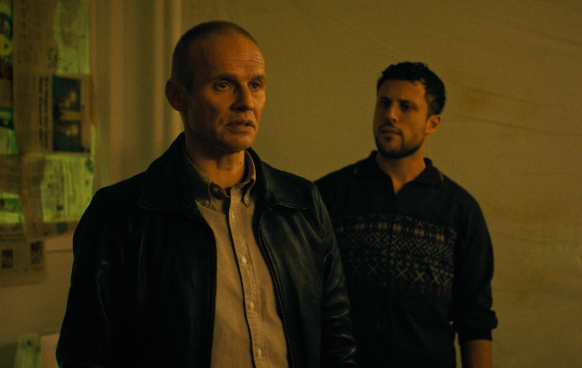
Inspired by a true story, Clean follows an ambitious police officer caught between his duty in the “War on Drugs” and a personal fight to save his brother from the drug underworld. As the pressure to follow orders mounts, he’s forced into painful decisions that test his commitment to the law against his loyalty to family. Directed by Koen Van Sande, the film was captured by Hyun De Grande, SBC.
The two first collaborated on the acclaimed TV show Glad Ijs in 2018. “It was not long after that time when we already started talking about Clean,” begins De Grande. “Koen and Iare practically neighbours in Brussels, and we became friends during the shooting of Glad Ijs. Over the course of all these years we’ve spoken about this project, so it was interesting to see the evolution over the years of what the project went through.”
Although De Grande wasn’t involved with the writing process, he felt close to the project as he was bouncing ideas off Van Sande. “The process felt natural because we know each other so well and we understood what we both wanted from the project as we discussed it so many times.”
Based on a book, Clean started off as a literal adaptation, before becoming more loosely based on the original source. “It started going in its own direction,” adds De Grande. “Koen started to implement his own personal experiences and stories into the script. From the moment we started to part ways from the book, it became more important for us to shoot it in Brussels, because it’s where Koen and I live. It’s his environment and so he’s more familiar with it than the original setting of Antwerp.”
When it came to visual references, De Grande notes that one of the first films they referenced early on was Lynne Ramsay’s You Were Never Really Here. “The general mood of that film appealed to us for our own take on this project, as well as the use of very close detail shots, which Koen referred to as haptic images. This was something we wanted to use as a way to enter the mindset of our characters, which we then further researched with references from other movies as well.”
De Grande and Van Sande also spoke about Se7en and Amores Perros, as references for specific elements. “We likedSe7en because of the dark aesthetics and texture,” says De Grande. “Texture was something very important for Koen from the beginning. Koen wanted grittiness! He wanted all the locations and places, especially the drug environment of the users as tactile as possible, where you could really feel the dirtiness of those places, and where you can feel the needles lying around etc.”
De Grande wanted a rich yet confined colour palette for the film, with dark and muted tones. Mainly consisting of greens, cyans, oranges and yellows. Colours such as deep blues, purples, reds and pinks were avoided as much as possible, with the exception of one hallucination scene, which was completely bathed in pink.

“We wanted dirty colours for the look, and high contrast dark palettes,” he says. “And for me, Se7en is a film that has those qualities, that also uses harder expressive lights and it’s not afraid of darkness within the frame. Whereas, Amores Perroswas specifically about textures and the roughness for me. We also spoke about photographers, especially Danish photographer Jacob Aue Sobol. He is primarily known for highish contrast and high textured black and white images, which I found very interesting to look at.”


“Another interesting photographer for me, was Boogie, who is known for his raw portrayals of people at the edge of society. He was also a valuable reference on a textural level, and for a general reference for the drug world.”

The film was captured over a period of 25 days during early 2025. De Grande opted for ARRI ALEXA 35 combined with Leitz Hugo lenses. “We knew we’d be shooting extensively at night and in low-light environments, where I also wanted to have the ability to shoot certain shots with deeper depth of fields to enhance the textural feel, and the ALEXA 35 gave us the sensitivity we needed,” he explains.
Additionally, there were the texture profiles from ARRI that they tested. “We used the G422 Custom Shadow Nostalgic profile, which is a texture that is optimised for lowlight environments and had quite a distinct presence of grain, size and structure. We were going to originally add grain in post, but when we started the grading and saw what the texture in camera already did in the shots, it already felt very present and organic, and it had the exact feel that we were looking for.Originally, some years ago, we wanted to shoot this project on 35mm film btw, for which we shot film comparison tests in 2021 between the Kodak 5207 and the Kodak 5219 stocks, but unfortunately we could not achieve that in the end.”


De Grande acknowledges that Leitz Hugo lenses were exactly what they needed on the project, as they didn’t want to use clean, modern optics, but they were also not looking for very soft vintage glass either. “Those Hugo lenses are based on old photography Leica M lenses and have a bit more character than just clean, modern optics which was appealing to us. You can really see that in the bokeh and the focus fall-off towards the edges. They are sharp in the centre, but softer near the edge, and they have quite a high contrast look as well; which were all perfect characteristics for us. They’re also compact, lightweight and fast, which was also very important.”
“We also never wanted to shoot anamorphic for this project,” he continues. “We knew we wanted to shoot in a wide aspect ratio, but not with anamorphic lenses. That was an approach we very quickly disregarded very early on, and the main reason was that we wanted to keep the look as realistic as possible. We both had the feeling that shooting with anamorphics would add a certain dreamy quality to it, that we were not looking for.”
The overall lighting goal was to keep it grounded and realistic. “We avoided moonlight and/or a general night ambience as much as possible to make the practicals become more prominent, both in INTs and EXTs, and to make spaces naturally feel darker. For interiors, we never introduced moonlight through windows, which was a clear creative decision from the start. This supported our intention to present the outside world as subdued and dark, only adding light where it was motivated and necessary,” says De Grande.

“For example, on the rooftop, where the brother meets his friends, we introduced additional practical fixtures through the art department, such as small industrial bulkheads on the wall, as well as a fluorescent with a low CRI above the artwork.”


The riot sequence at the beginning proved particularly challenging to capture. “That was the original opening scene in the script, but now the film opens with the brothers in the car,” says De Grande. “That was one of the most challenging scenes to do because we had so much going on. What you see in the final movie is very fragmented with a fast-paced edit, but how we shot it was more like a full blown out scene with lots of additional elements going on that didn’t make the final cut.”
The sequence was shot over one packed day. “We used Steadicam to follow the characters in full 360° directions, while coordinating explosions, fires, stunts and drone footage. And at the same time, some extras were asked to simultaneously shoot some footage with their phone, that would be used as source material in the movie. It was a complex sequence with many moving parts.”
That location was essentially an open parking lot next to a building. “Our base setup consisted of a Vortex unit on the roof of that building plus another Vortex that we rigged to an existing lightpole in the centre of the parking lot. We also used the available streetlights on the location, and we added some AX spots on the same adjacent building to create some accents on the façade, and to hit the characters as well near the building. Some additional AX spots were put on the floor on the other side of the parking lot, to create uplighter effects on the brick wall in the background.”
To create direction, De Grande used Ultrabounces on a shot-by-shot basis, which became a key shaping source. That formed the core approach for the location.
(BTS photo by Toon Aerts)

(BTS photo by Hyun)

De Grande worked closely alongside art director Natalia Trevino to help bring the project to life. “We already knew each other and so I suggested her to Koen for the project,” he says. “It was great exchanging ideas and talking about colour. We all had similar ideas about what the visual style should be. Everything felt almost effortless within the limitations of the project. Natalia really helped a lot in creating the look. For example, by introducing extra coloured elements on / in front of windows, to introduce some extra colour in the light in a natural way, such as in the parked bus scene.”

“For the scene just after Mathieu has a drug injection at the dealer’s place and he exits the building, Koen wanted to create a feeling of a very soft and a very intimate / safe space, which he described as a mother’s hug. Natalia and her team did a fantastic job of covering the whole staircase in a soft pink fabric to achieve this result.”

A surprising last-minute challenge was the apartment of the dealer, where the crew had originally chosen an empty apartment that had the perfect shabby look that they were after. “It had old-fashioned style wallpaper and curtains, and the apartment was not in the best state, which was perfect for us.”
(BTS photo by Hyun)

“But I think it was only 1 or 2 days before we were scheduled to shoot there, that we received a phone call from Natalia, who was there to start prepping the set, that someone (I think the owner) had decided to remove all the wallpaper and curtains, and paint the whole apartment in bright white; which was off course terrible news,” says De Grande.
Within the very limited time they had left, they made an improvisational decision to add plastic foil everywhere, which made total sense, because he’s a guy who doesn’t want to leave traces behind of his operations. “And we added newspaper in front of the windows, based on the idea that the character would do that himself to hide his actions from the outside world,” says De Grande. “Along with this idea, we decided to change the lighting approach as well, and we lit the space very robustly with some construction-site lamps on the floor, which we augmented with some extra fixtures just below the ceiling (out of frame). I feel it actually ended up much better than what we had originally planned because it gave the place a menacing vibe instead of a shabby one. Itwas a good reminder that you always have to remain open to new ideas, and be prepared to go with the flow when needed.”

De Grande really enjoyed working on the project. “It was very valuable and fun because it didn’t feel like a job where you just come in, prep, shoot and then leave; since Koen and Italked about the project for years and I saw the project gradually evolve,” he concludes. “Working with Koen made it very fun because we know each other so well. He gave me full confidence in my work, as well as creative freedom to do what I believed in. We had a great cast and crew which always helps too! And the visual style was something I really loved doing as well, so all those elements made it feel like a passion project.”
(BTS photo by Toon Aerts)

Key Crew
1st AC: Vincent Segers
GAFFER: Laurens De Grande
KEY GRIP: Tomas Van Camp
STEADICAM: Sander Blok + Jo Vermaercke
GRADING: Xavier Dockx
By Oliver Webb