Dries Delputte on shooting Albatros
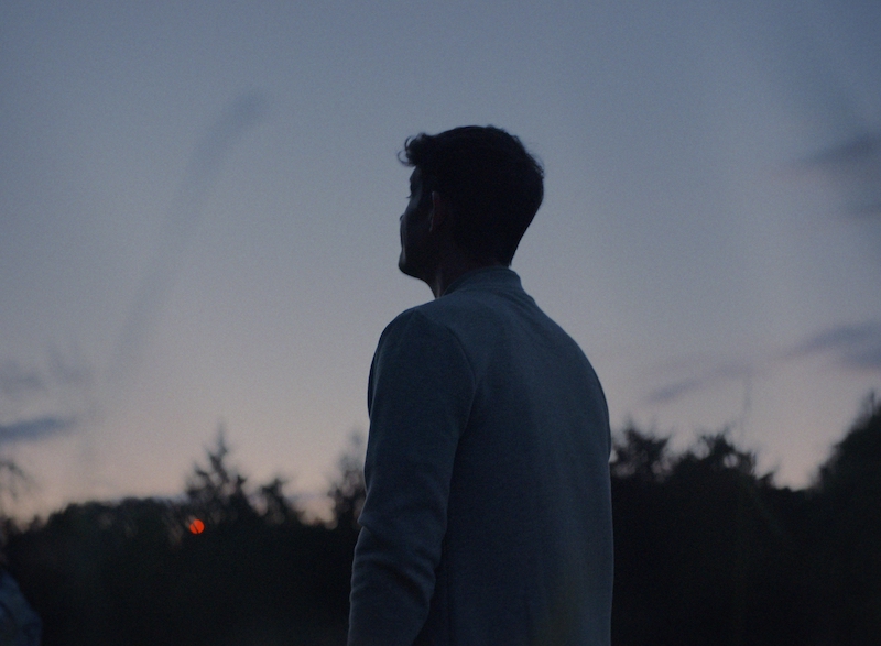
The lives of ten strangers intertwine when they join a weight-loss camp and are faced not only with the battle against their bodies, but also their minds – and each other. With a dead mother, a dark secret and lots of unresolved resentment, camp guru Bart has his own demons to fight.
Shooting the tv series Albatros cinematographer Dries Delputte continues his working relationship with director Wannes Destoop.

How did you land this project?
Dries Delputte: Wannes involved me pretty early on.
He had me read different versions of the script, which we then discussed together. It has been educational to be involved at such an early stage, especially in the final phase when choices were made with the production process in mind and its feasibility.
But at the same time, I discovered that being involved too early in the writing process also can have a downside. Doing it this way I am very aware of the compromises that have been made or of what the loose ends are in the storyline.
I like to keep a fresh look, the first time I read a shooting script.
How did Wannes and you make the evolution from doing short films together to larger productions? Did this require a different approach or communication?
DD: I met Wannes for the first time on the set of “180”, a tv show by director Jakob Verbruggen and DP Ruben Impens, for whom I was working as a gaffer at the time. A few weeks later, we were filming a thesis film together somewhere under a bridge in the port of Ghent. A year later, his graduation short film that I shot at the KASK film school ‘Badpakje 46’ won the “Prix du Jury” at Cannes, awarded by Michel Gondry.
In hindsight, we didn’t really realize the full impact of that adventure. I received several offers for projects in the US and France, but regrettably I never really followed up on this.
Since then we continued working together on various commercials, music videos, and short films. I had already shot a few tv series (among others Tabula rasa, Bende Van Jan de Lichte, The Twelve) so for me, it was not a new thing to work on these kinds of bigger jobs. This allowed us to continue working together in the same pleasant way as before. Although this time longer and more intense.
Was it a difficult subject matter for the cast to be part of and did this have any effect on how you were able to work on set?
DD: Yeah, sure. It was a very personal subject matter for the actors.
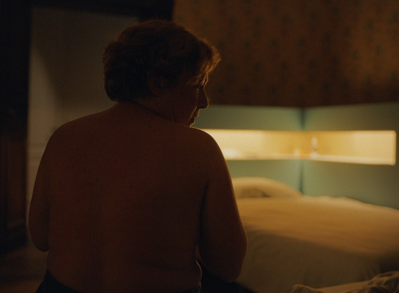
Literally and metaphorically, being naked on set, they were very vulnerable. Wannes has a very disarming and personal approach to let the actors perform those emotions.
And once they had passed that barrier and got the feeling that they had the necessary freedom to perform on set, it created a “safe” space for them to let wonderful things happen in front of the lens.
It’s always a special feeling as an operator when you’re physically that close to the actors on a short lens. You feel part of their emotions with your different senses. Through movement, the heat of their body, the smell of their sweat. You feel their aura, as it were. It is important that you have a good rapport with the actors and create a pleasant environment where they can perform.
What kind of look did you have in mind for the show?
DD: Our aim was to create an intimate portrait of each character through our imagery, engaging the audience with the characters. Without being too tight, we wanted to create poetic visuals that still felt realistic. The series is character-driven and we wanted to use the images to reinforce the story. That is why we chose to create as much of an organic feel as possible.
For the look of the show, we found inspiration in one of KODAK’s finest film stocks: the PORTRA 400 and 800, used for Portrait photography and landscape. Beautiful skin tones and warm colors are the strengths of this stock. So that formed the base for the LUT that I created with colorist Olivier Ongeux at Micros for on set use and dailies.
Contrast was created by making the costumes stand out against the background. A dark fabric against a light background or just the other way around. But also by using color we could easily obtain this effect while being careful that it didn’t become too much of mix mash of different colors. We stayed within a range of pastels avoiding primary colors going for a beautiful combination of monochromatic colors, which formed a harmonious whole.
Did you use any references?
DD: The references we used where mostly photographs from various artists and photographers that I collected from blogs and Flickr.
As for camera movement and framing, we looked at the film Wuthering Heights by Andrea Arnold and for composition The Ghost Story by David Lowery. But there was not one specific movie or one particular photographer that was a reference to us.
Could you tell something about the aspect ratio of the show? How and why it came to be?
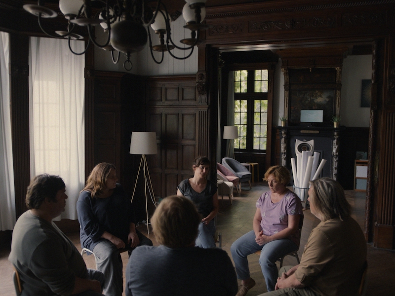
DD: We consciously chose the Academy Aspect ratio 1:1.37, because we felt it was the best way to frame human faces. Vertical lines in the frame get more emphasized and we could show more of the human body than for example in the 16:9 ratio. This way a face or a body literally fills the frame, there is little or no distraction from the surroundings, connecting the audience closer to the characters by being intimate.
It also helped to create a boxed-in claustrophobic feeling, just like our characters feel trapped in their own body and mind.
For this reason, I chose to shoot on the Arri Alexa Mini using the 4:3 sensor mode created for using anamorphic lenses but without desqueezing the image so we had a slightly larger sensor area than regular super35. Thus staying closer to portrait photography. As for lenses we used a set of Leica summilux-c with the 29 mm and 40 mm being workhorses for the show.
How did the broadcaster react to the aspect ratio? Was it easy to convince them?
DD: No, it wasn’t easy to convince them to let us use this aspect ratio.
We made a specific briefing for Canvas as to why we wanted to film using this format. Stating substantive and artistic reasons for our choice and why this could be of more value for the series.
At first, we received some positive feedback on our choice. But a few days later we got a No on using the format. “Because it would look weird for the audience to have a show in 4:3 follow one in 16:9 in the broadcasting line up.”
It was only after we drew their attention to the fact that they still broadcast certain reruns (e.g. FC the champions season 2) in 4:3 that they realized they had never really gotten any reaction from the viewers on this, and so we were given the go-ahead on using the 4:3 ratio.
Did shooting square make it more difficult to frame scenes, for example, wide group shots? What did you have to take into account?
DD: In the beginning, it was quite an adjustment, the vertical lines in your image are much stronger. But it became very quickly intuitive and I had little trouble making compositions on the fly.
Any thoughts on the post-production?
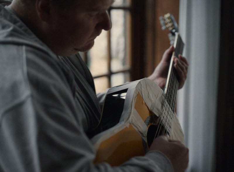
DD: I often and gladly work with colorist Olivier Ogneux.
Before the start of the shoot, we made a show LUT together for on set monitoring and dailies. So we didn’t have a lot to change in grading. Maybe we desaturated everything a bit and added a layer of 35mm film grain using base light at Micros. The VFX department of Micros also did a nice job digitally removing the leg of actress Ruth Beekmans, whose character had her on of her legs amputated.
